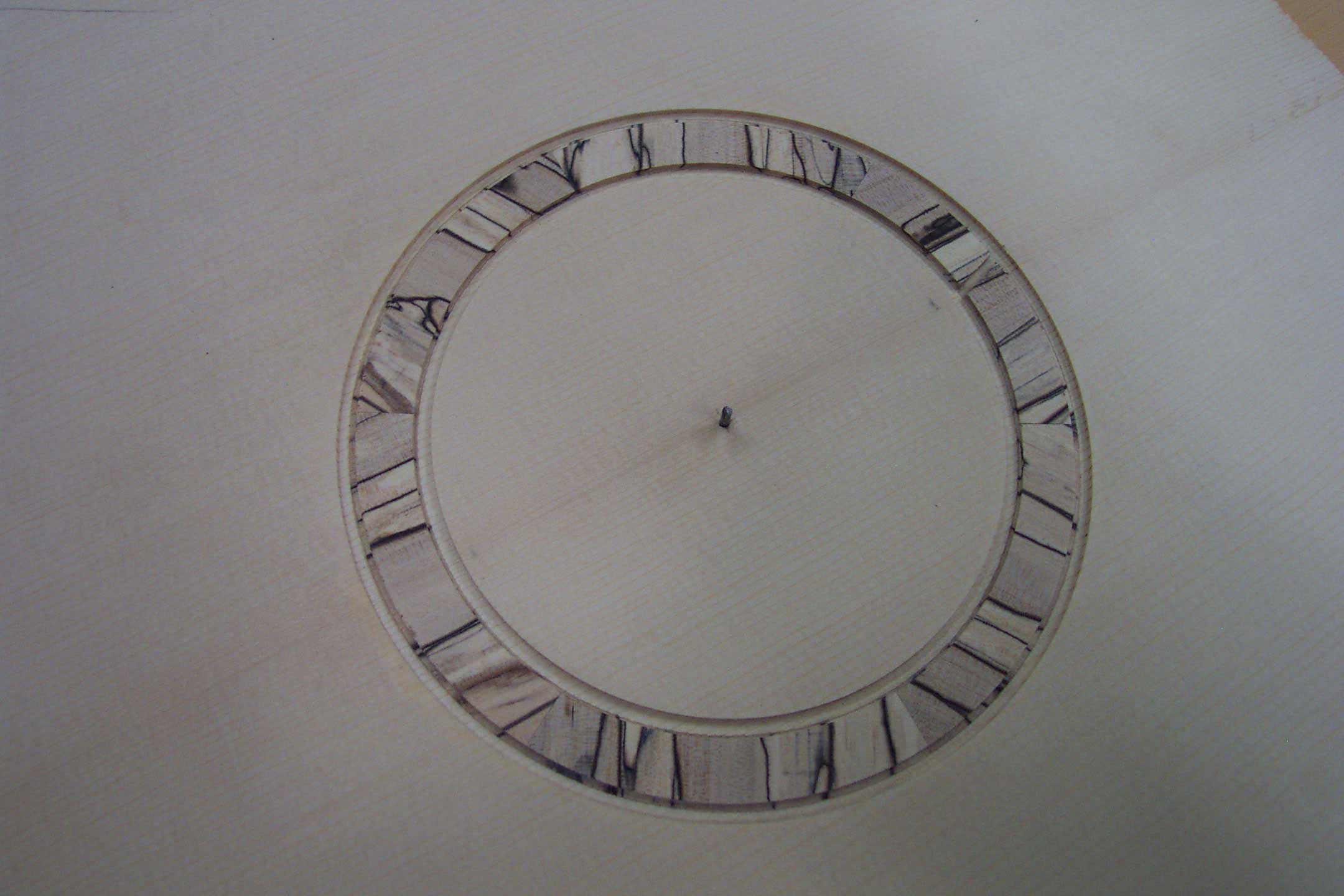
I decided to keep the maple plain. After gluing on the laminations and scraping flush, I started liking the hues that were coming out...
But after gluing it in, I saw there was a small crack. It was only in one section so I still have no idea what I did to cause it...
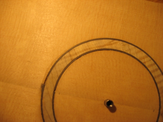
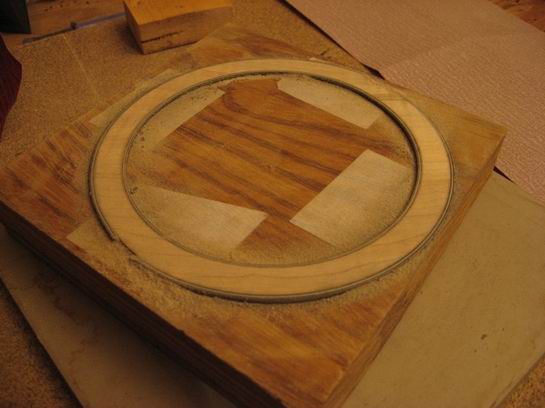
Needless to say, I was a bit peeved. I routed out a section 1/16 wide and I inlayed a new b/w/b lamination.
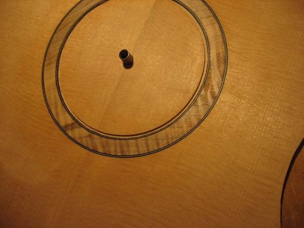
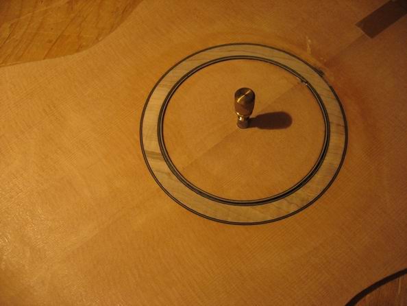
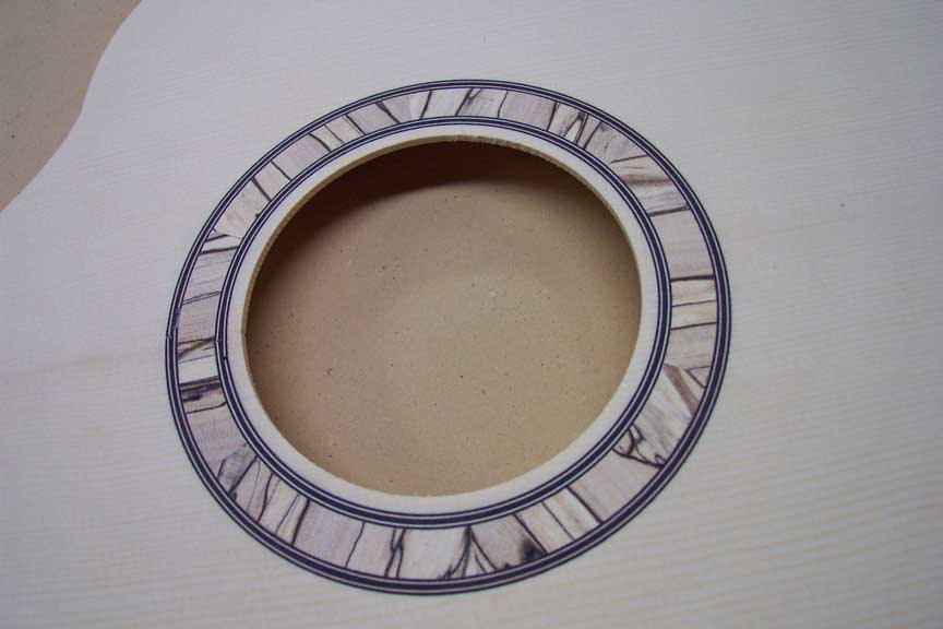
Now I just have to scrape that flush and it should be flawless. Still, I'm debating if I want to rout out another 1/16 on the outer edge to have perfect symetry...
What do you guys think? Do I need to match them?
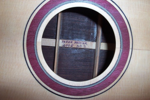
Thanks for looking.


 "
"